Urban Renewal Directorate
Urban Renewal Directorate
A re - branding project I led as part of my work at Brief
studio, which includes logo design, print and digital products, and a brand book.
I picked the colors blue and white in order to convey
the brand values of reliability, accessibility, and stability. Additionally, I chose the color gold to establish a visual connection with their partner, the "Jerusalem
Development Authority", whose logo is also gold.
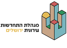
The brand's symbol started with the concept of disassembly and assembly and after that developed into a structure which combines elements of Jerusalem.
The logo design uses the simple and soft “Fredoka SemiExpanded” typeface, which makes the logo feel
more pleasing and welcoming.
My Role: Concept, Design
Tools Used: Illustrator, Photoshop, Indesign
Client: Urban Renewal Directorate JLM

Sketches for logo design


Brand's Values
Stability
The Jerusalem Directorate
for Urban Renewal
provides city residents
with a stable and secure environment.
Accessibility
The Jerusalem Directorate
for Urban Renewal
speaks at eye level
and addresses all residents
of Jerusalem alike.
Reliability
The Jerusalem Directorate
for Urban Renewal is committed
to promoting the interests
of the city and its residents
while maintaining transparency.


